For project 3 we are to analyze print ads as well as commercials. For this in class blog, I will analyze these 3 ads. 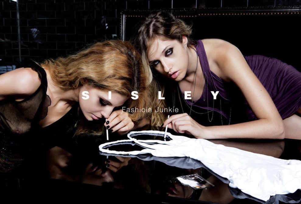
 each of these ads has a very obvious statement but it is not clearly written on the ad. These are examples of things we just kind of look at and think to ourselves “How the heck was that allowed to be printed?!” In any occasion, I am here to analyze these ads, whether I agree with the marketing strategy or not. The first image is for a clothing line. The ad is of two models looking like they are snorting drugs, however in this case the drug is the dress. The printed text in this ad says “Fashion junkie” this is a play on how drug addicts are. When people who use illegal substances and depend on them, they are said to be “junkies.” So in this case, the girls are addicted to this fashion line, making them seem to get a high off of the dress, causing them to be “Fashion junkies.” Their body language also corresponds to the drug theme. They are hunched over, very close to the table, they look thin and frail and weak. Also, they eyes seem to be glazed over, just as someone who was under the influence would look like. The audience of this Ad is definitely the teens, the partiers, the girls who want to look good and have a good time. The colors are all dark, they are in a black room, have dark make up on, and have dark nail polish. Darkness is being portrayed here and the white dress is the purity that can take the girls back to the light side. The actual text in this ad is also important, the name of the brand is in bold, all capitals, and is white. The words “Fashion Junkie” are underneath the name of the brand, not in all capitals, thinner, smaller, and also not as prominent. This is because the seller is trying to get the point across without the text. The text is there to back up the image, the image is the prominent aid for this Ad.
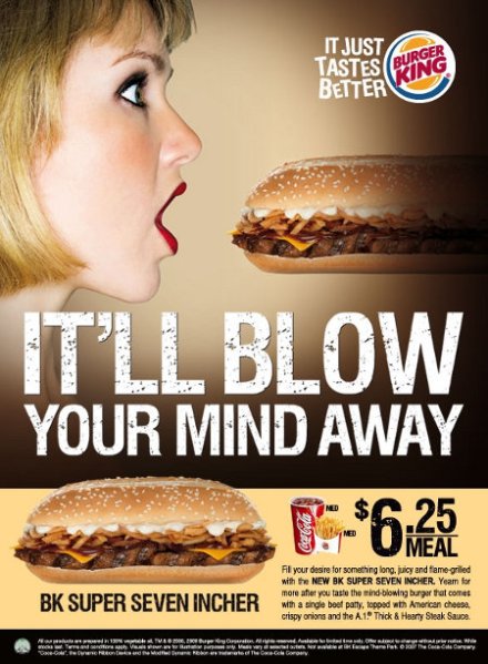
The next Ad for Burger King is definitely one of the Ads that I looked at and thought “Is this a joke? It must be. There is no way this is posted on the side of the restaurant right now.” This Ad is intended for a male audience. The colors of the ad make it seem like the girl is maybe in the shadow of something else and is maybe in a confined space with just an overhead light. Now of course, any mature audience would see the sexual innuendo of this ad. I’m not going to go into detail about that, I’m pretty sure you all can see it for yourselves. This ad is something that I would not want my younger siblings to see and ask what it meant. The girl is wearing dark eye make up and also wearing red lipstick. The color red is the color that symbolizes love, and passion. The ad is trying to say that your mouth will love this sandwich. What makes this ad a little inappropriate is the positioning of the sandwich as well as the way the girl has her mouth open. The text says in huge white all capital letters that the sandwich will “It’ll blow your mind away.” What is significant about this text is that it is in two rows. The first line of text just says “It’ll blow” in bigger letters than the line below it. This text grabs your attention and pulls together the sexual innuendo that was being portrayed by the image. Also, the text is white, white is supposed to be pure and innocent; the sellers did this to take the edge off the ad and make them look like they are innocent and didn’t really intend for this ad to come across the way they did.
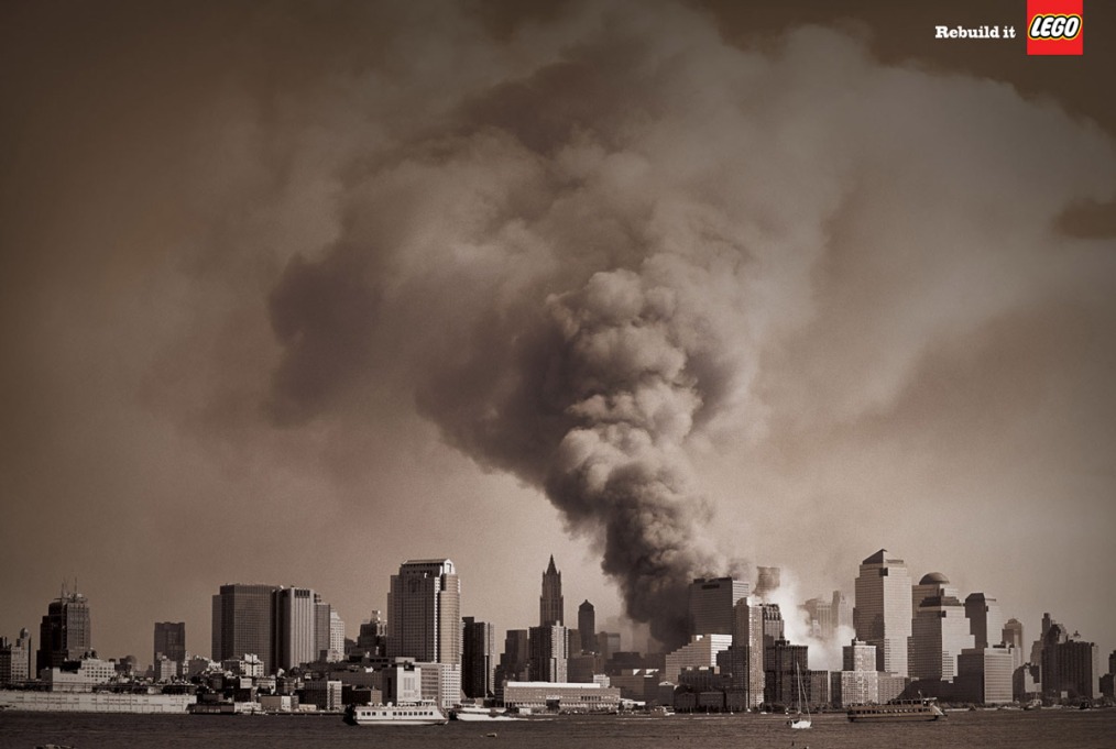
the next ad is one for Lego. This ad is definitely one that hits a soft spot in every American’s heart. This ad is intended for everyone. It is black and white which indicates a somber, more intense feeling to the ad then it would if it were bright and cheery and filled with color. This ad is a nostalgic ad that hits home with Americans who witnessed the terrorist attack on September 11, 2001. The image is that of Manhattan covered by a cloud of smoke that was a result of the plane crashing into the Twin Towers. The image itself is a powerful one, one that gives me chills every time I see it. The thing about this ad that stands out the most to me is that the image is the most prominent thing in it. There is text, however it is not centered, large, or trying to overpower the image. The image speaks for itself, and the text in the right hand corner just enhances the meaning of the ad. the text says “Rebuild it” and then the Lego logo. This short, but very powerful statement gives the audience the feeling that they are able to save the city and restore it back to its original glory.

 August 9, 2012
 devynturner


